Sunday, March 28, 2010

watercolor sketches

I've been trying to learn me some watercolors.  I've been doing little sketches and adding wash to them.  Here are some of them.  Pretty fail on the whole, but I'll get better.

Saturday, March 27, 2010

Good Gravy! Finished the Midterm.

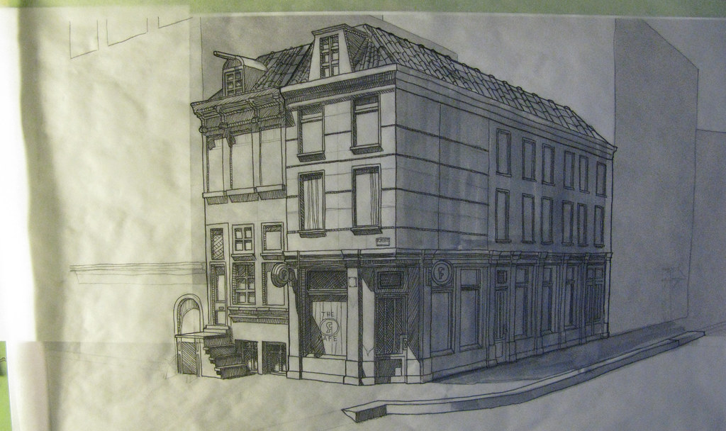
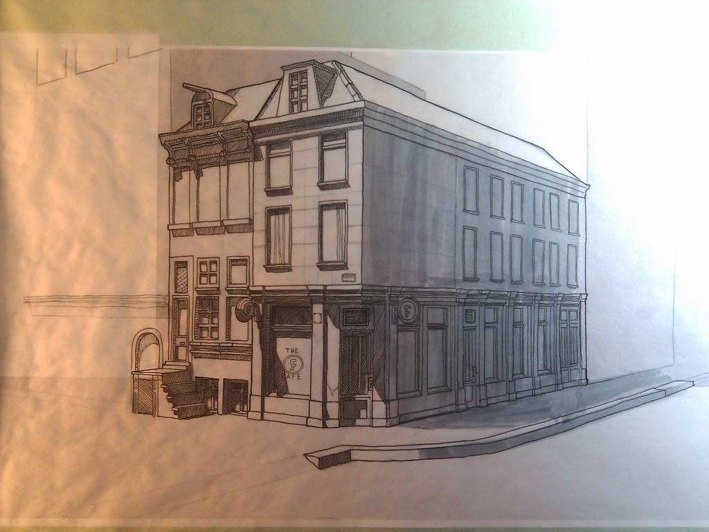
For my midterm, I decided to design a bar/cafe in a Dutch style.  I did two canalhouse style buildings connected internally.  The kitchen of this little cafe is actually located in the canalhouse to the left of the actual establishment.  A passthrough leads to the kitchen and restrooms in the adjacent house.

Here's the plan I went with:


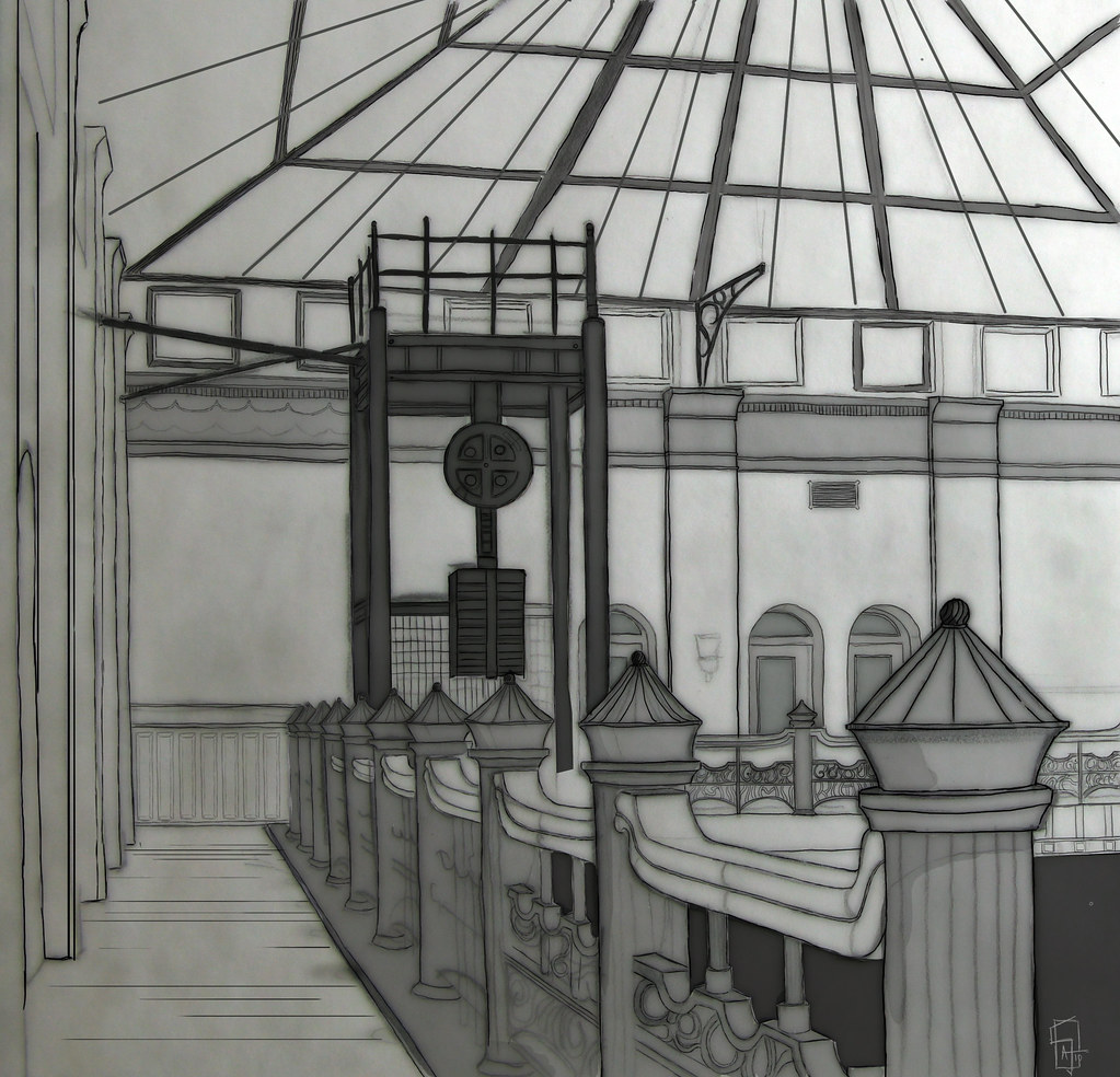
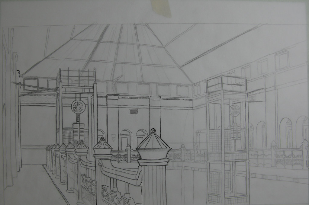
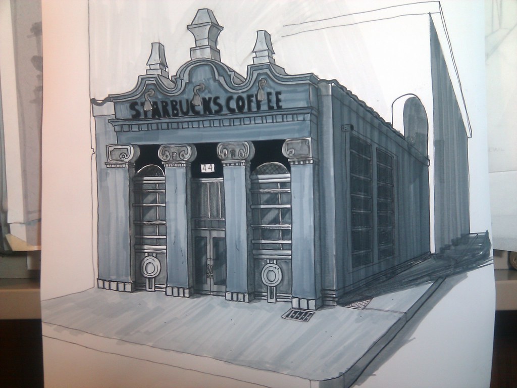
And here's the final exterior/interior ink and marker drawings.


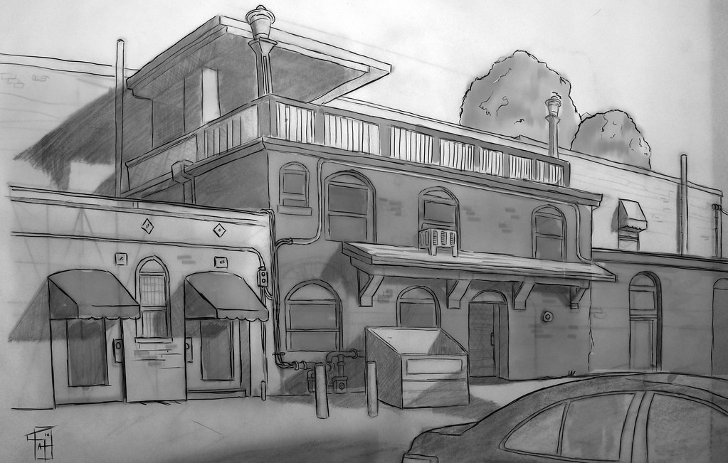
Hope you all enjoy.  My reference mostly was all from wandering around Holland in Google Streetview.  Super great way of getting a complete 360 view of HEAPS of different architectural styles.  Japan's in there, London, New Zealand, Scotland, Northern Ireland...check it out!

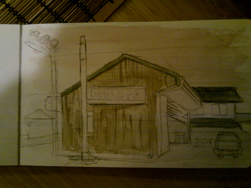
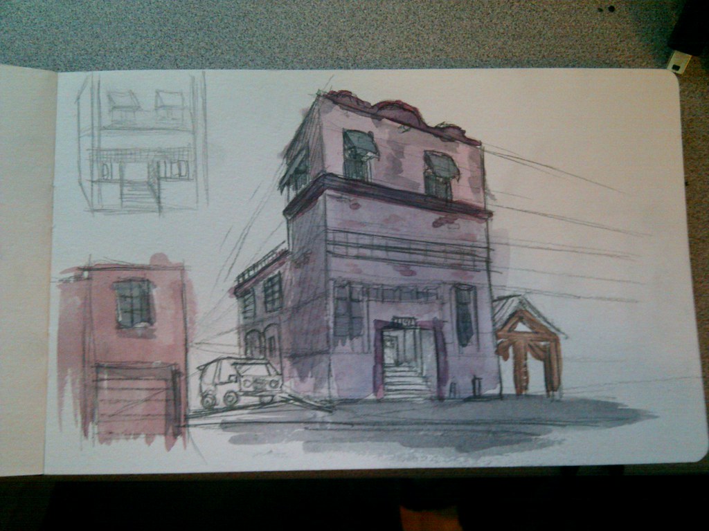
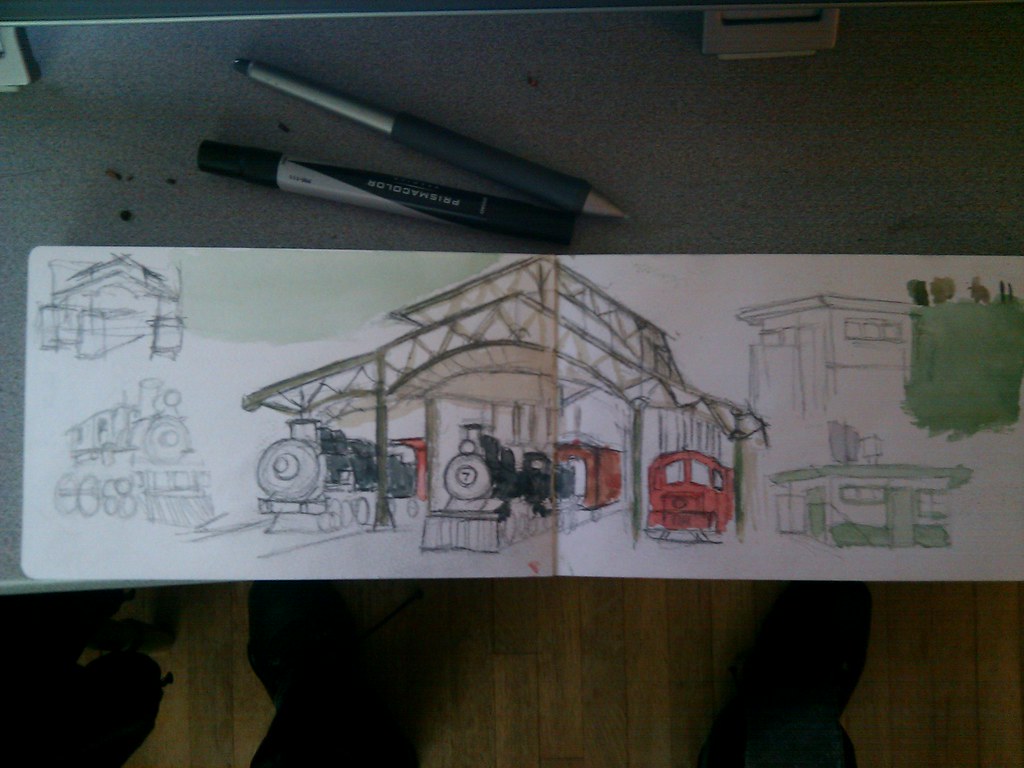
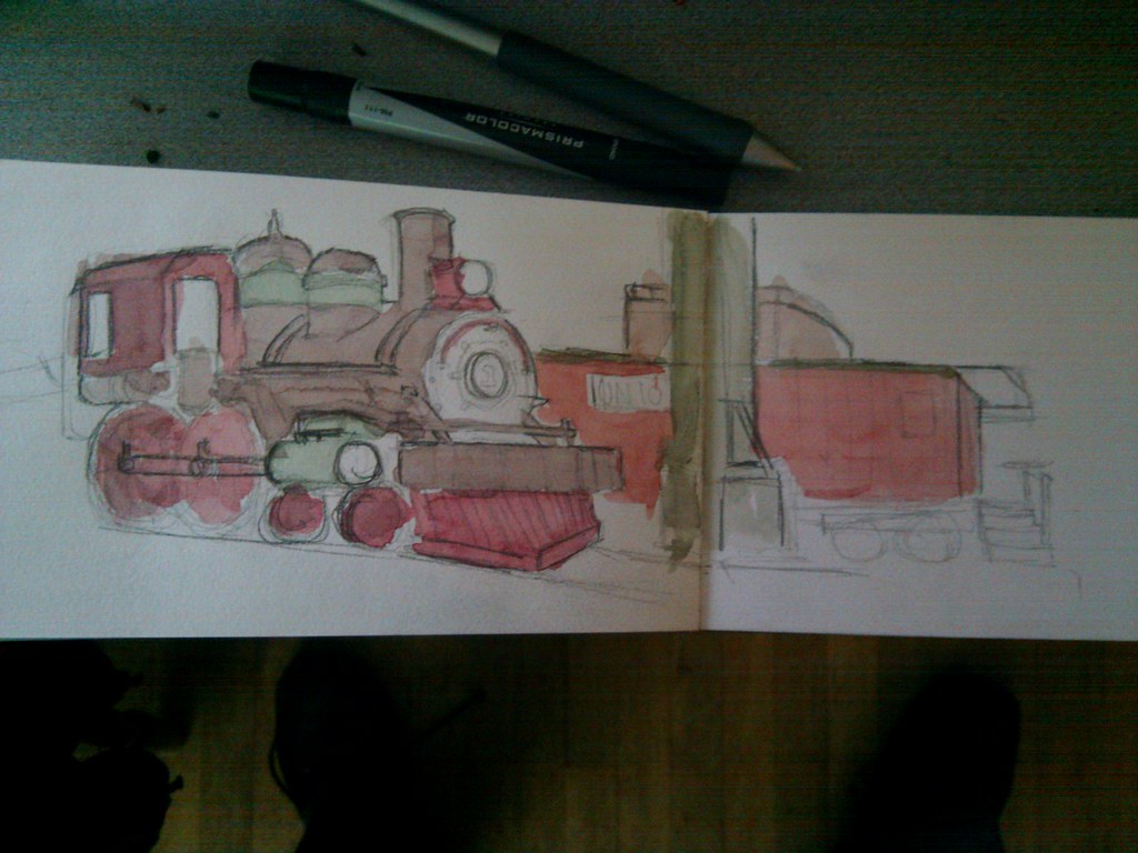
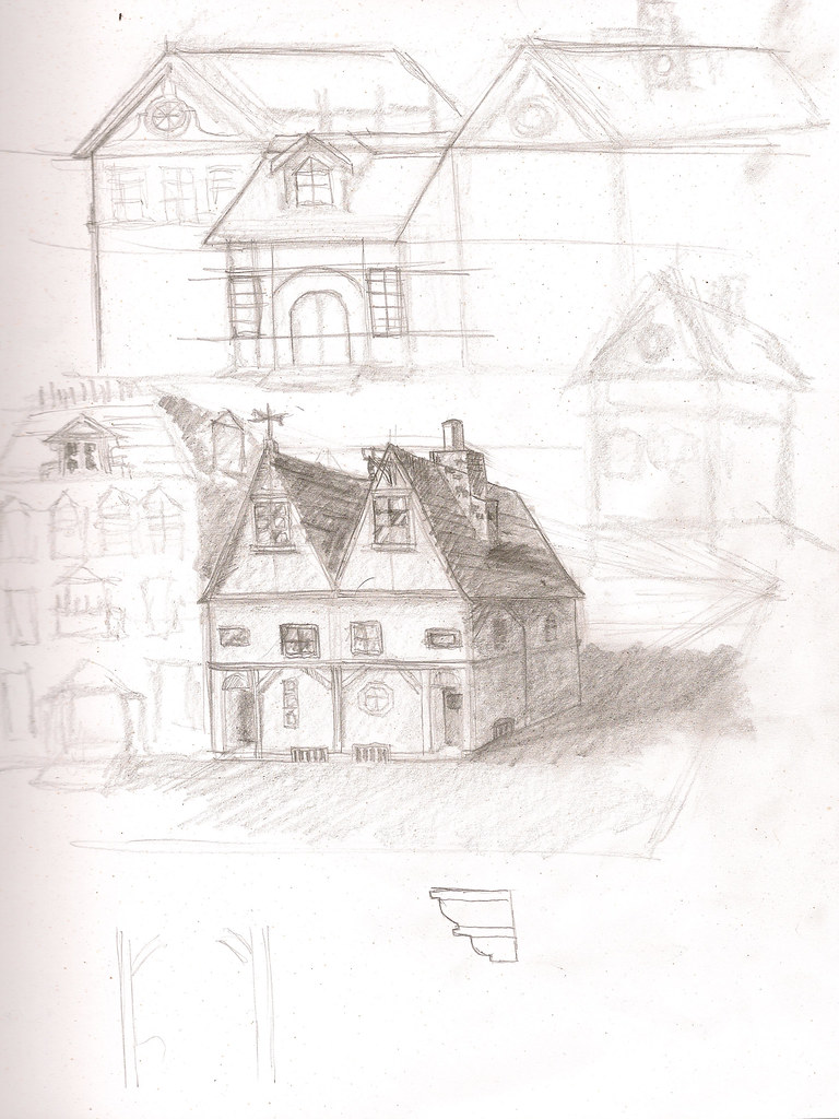
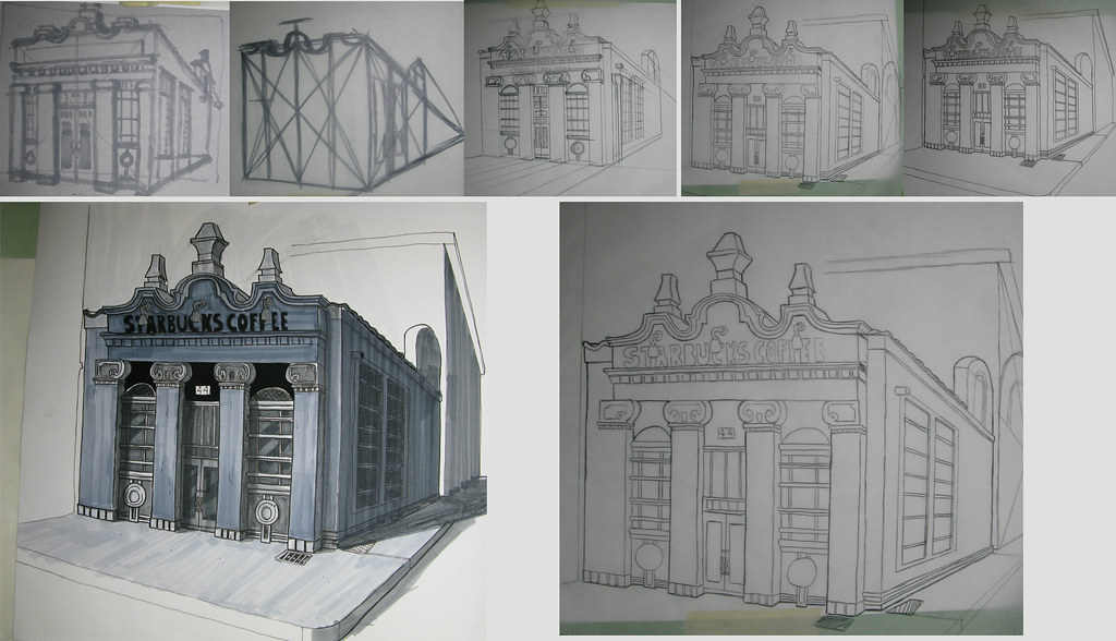
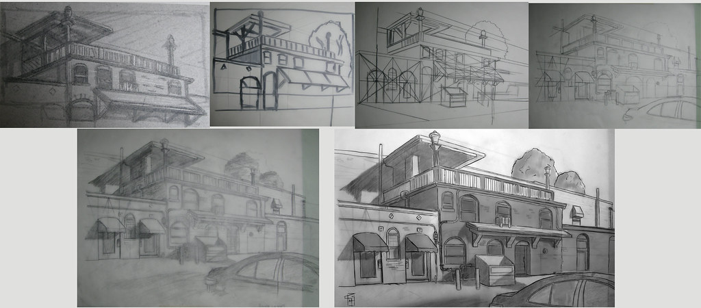
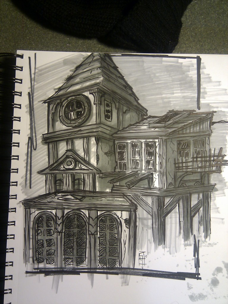
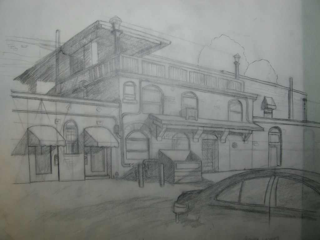
This really took up so much of my time.  Hopefully I can get back to what ive been enjoying a lot of, which is flying around streetview, sketching out architecture, and coloring it with watercolor.  Ill post up some of my first horrific sketches tomorrow.  Too tired now.

Monday, March 22, 2010

Ink finished. Color begins.

As always, not totally happy with the inks, but hey its better than the last project right?

Starting on Colour now, gonna try and do a digital watercolor, very low saturation high transparency sort of coloration.

Saturday, March 20, 2010

a quick sketch

Im on a mission to complete this sketchbook.  I have a couple months to go.  Hopefully ill get a bunch of good stuff on our trip to SF next week!

Ink Ink Ink Ink

Just decided to dive right into the exterior design portion of my midterm assignment.  It's going to be a little bar/grill done in a Dutch architectural style. (in tribute to our upcoming fall trip to Amsterdam).  Took a bit of wrangling to get the perspective clean, and now i'm focusing on graphic crosshatch shapes to add visual interest to the shadow shapes.  Quite a bit of work to do this weekend, then on to the interior.

Tuesday, March 16, 2010

Squarefest

Cubes cubes cubes.  I'm also starting to sketch out some notes/ideas for my midterm assignment.

Sunday, March 14, 2010

Works

Here's my latest class assignment.  I spent a little longer on this guy than the others, but in a shorter period of time, if that makes sense. 

I originally intended the illustration to be a wide shot of the top floor of the Bradbury building in Los Angeles, but I decided after penciling it in that it just felt way overwhelming from a detail perspective.  The sheer amount of linework on the page just kind of flattened the entire image.  I took an interesting crop, and roughed in some tones and played with a bit of line thickness.  It's rougher than i'd like, but isn't that always how it is?


Also, here's a sketch from our recent class visit to the Descanso gardens.  All of my other sketches of just foliage met with utter failure, and will certainly not be shown here.

xoxox readers.

Wednesday, March 10, 2010

couple of mornings of quick still life arrangements

Been feeling busy recently, but not busy enough to get my homework done....I have to get on that.  BUT FOR NOW!  Still life arrangements!  Not the most interesting, and not the cleanest, but I plan on getting a good setup here starting next week

Monday, March 8, 2010

little morning sketching

Just a few quicker sketches as I double fisted coffee this morning.


Sunday, March 7, 2010

Quick(ish) Academy Awards Sketch

I love playing with the loose sketchy fun of the Pentel Brushpen!

Saturday, March 6, 2010

oh

Here's the pencil versions of both

Homework finished.

sheesh that took forever!  Here's two shots showing the progression of both illustrations.  I'm not really happy with either of them, there's something in my line quality that just feels goofy.  The second building's perspective is way better, but it just feels too "bleh" to me.   I like the pencil versions of both more than the finished product....Anyways, here they are.


Thursday, March 4, 2010

illustration 1 finished

not particularly happy with it, but ive wasted enough time. My brain hurts, and ive discovered that I hate Copic markers.  They smear the ink layers, even printed and dried ones, and the fine nibs dry out 2x as fast as prismacolor.  They also don't layer as well.  Live and learn I guess.

Monday, March 1, 2010

More Cleanup

Here's a progress shot of the illustration i'm working on.  This is my first clean layer, done all freehand with a black prismacolor pencil.  I love the creamy thickness of line the prismacolor produces, but I hate how quickly I run through them!  After this layer is nailed down, I will create a final layer in black copic ink, photocopy it, and test out some tonal variations.  Once i've nailed a tonal I like, I'll lay it down on the inked final layer, and photocopy the results to get it on a white, non-parchment background.

Whew that's a bunch of work.  And I have one more illustration to do!

Here's the first clean layer in prismacolor pencil...

Here's the final rough layer with all the details I want included in the final illustration.